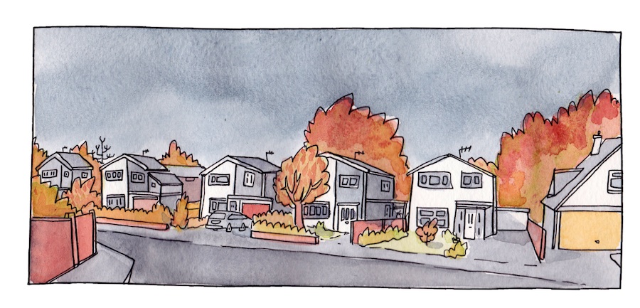
Well, I’m not entirely happy with it, but I think I’m getting somewhere with this. It’s a mix of ink & watercolour. There’s plenty more I could show you on this but I’m not going to – don’t want to give the game away too soon.
This looks great! I’ve been experimenting with a similar technique, but I really think you have something special with your use of colour. I did see a blogpost by one artist who said that they sometimes used a grey ink for outlines, but the bold black lines make your panel “read” very easily.
Thanks Pete – I’ve been trying stuff out. Not entirely convinced this is working yet though. This is largely un-monkeyed with in photoshop. I’m going to investigate some monkeying a bit though I imagine!


3 comments
This looks great! I’ve been experimenting with a similar technique, but I really think you have something special with your use of colour. I did see a blogpost by one artist who said that they sometimes used a grey ink for outlines, but the bold black lines make your panel “read” very easily.
Thanks Pete – I’ve been trying stuff out. Not entirely convinced this is working yet though. This is largely un-monkeyed with in photoshop. I’m going to investigate some monkeying a bit though I imagine!
There’s a touch of Kevin Ganges fella about this
Comments are closed.